Project scope
• My role: UX research, product thinking, interaction design
• Tools: Adobe XD, Usertesting.com, Optimizely
• Timeline: 4 months
• Deliverables: Prototypes, Quantitative & Qualitative data
• Team: Me, Product Owner, 5 Engineers, 1 QA
Background.
Bluehost is a web hosting company that provides a lot of services to help customers establish their online presence. Users face a lot of challenges when they are building their site. Bluehost provides solutions to those challenges that are located in the Manage Site section of customers’ accounts.
Challenge.
Bluehost users don’t know of potential features that come with their account and go straight into their WordPress site disregarding the Manage Site area. Additionally, users don’t immediately realize that two buttons are hiding in the hover state.

Solution.
Working closely with the Product Owner and Scrum team, we made the CTAs Solutionvisible to the customer to help direct customers to the Manage Site area of their account.

Below is a comprehensive Case Study research process
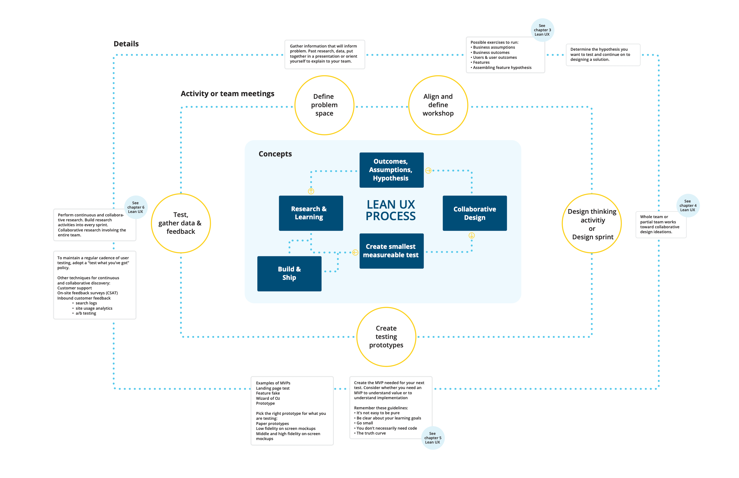
I like to follow a simple yet powerful process outlined in the Lean UX book when I work on software products. This process helps align the team on the problem we’re trying to solve and be all involved in the process of solving it.
Research & Learning
I like to follow a simple yet powerful process outlined in the Lean UX book when I work on software products. This process helps align the team on the problem we’re trying to solve and be all involved in the process of solving it.
Key findings
- My Sites page is one of the most visited pages in Bluehost accounts. A lot of people go through this page but the conversion rate on this page is very low.
- More than 50% of customers never visited their Manage Site page. Users overlook the Manage Site section because their primary goal is to work on their WordPress website.
- Manage site tools are vital for most users but they don’t know they have them in their accounts. Customers are looking elsewhere for the same tools they have in their accounts.
Quantitative data
- My Sites page gets approx. 45,000 views/day
- Manage Site button gets approx. 5,000 clicks/day
- Log in to WordPress button gets approx. 9,000 clicks/day
Qualitative data
- 6/7 users expected to be able to click on the Site card
- 5/7 users expected clicking on the card would take them to WordPress admin
- 2/7 users expected clicking on the card would take them to the site management page
Align and Define.
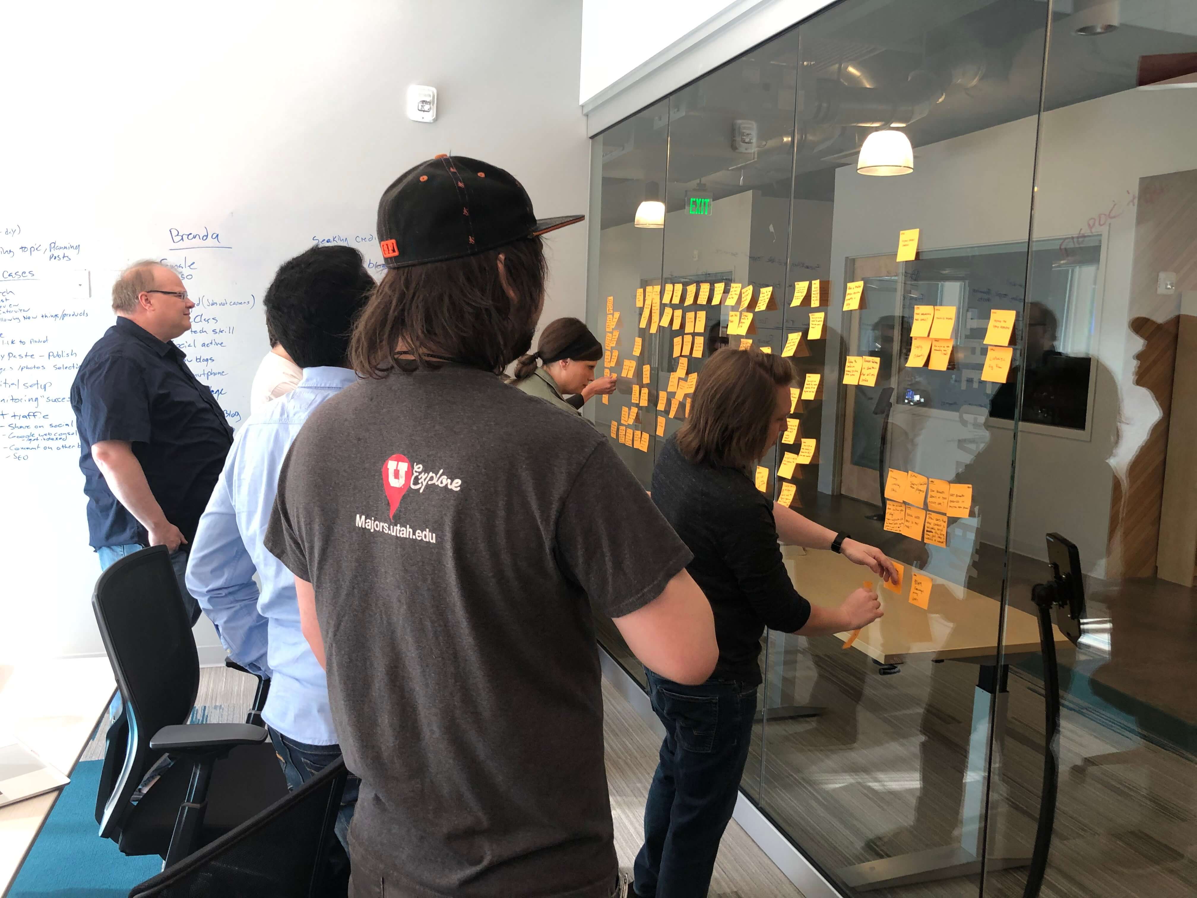
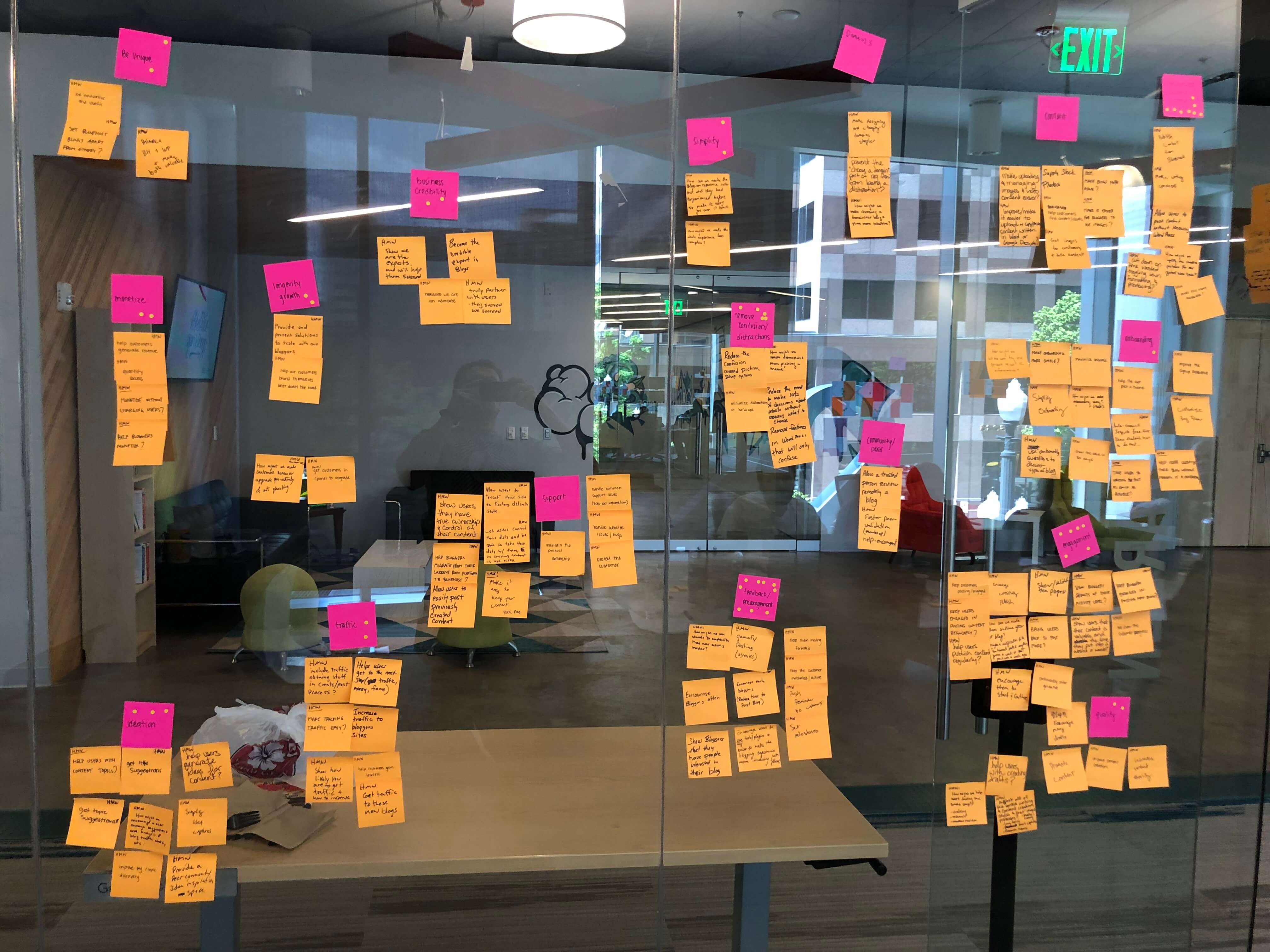
We got together as a scrum team to brainstorm and ideate the problem, outcomes, assumptions, and hypothesis.
Uncovering Insights & Identifying Needs
We broke down participants’ statements and my observations onto post-its and charted them out using an empathy map.


Top customer needs:
- Need to know where to find tools like “backups”, “marketing”, “site performance” etc.
- Need to have a quick way to go to WordPress from their Bluehost account.
- Have a simple way to edit the site name
- Have site statistics at a glance for all of their sites
- Manage SSL to keep information like logins, passwords, and customers’ credit card numbers safe.
Defining the problem
Based on the findings from the user research we were able to identify the problem users had.
Bluehost users don’t know of potential features that come with their account and go straight into their WordPress site disregarding the Manage Site area.
Forming a hypothesis
We believe users don’t know about the services and features Bluehost provides in the Manage Site area because it’s hard to discover. If we unveil those options to the user and point the users in the right direction they will have a much easier way to find those services and be more successful.


