
My Sites redesign.
Increasing user engagement by following Lean UX processes.
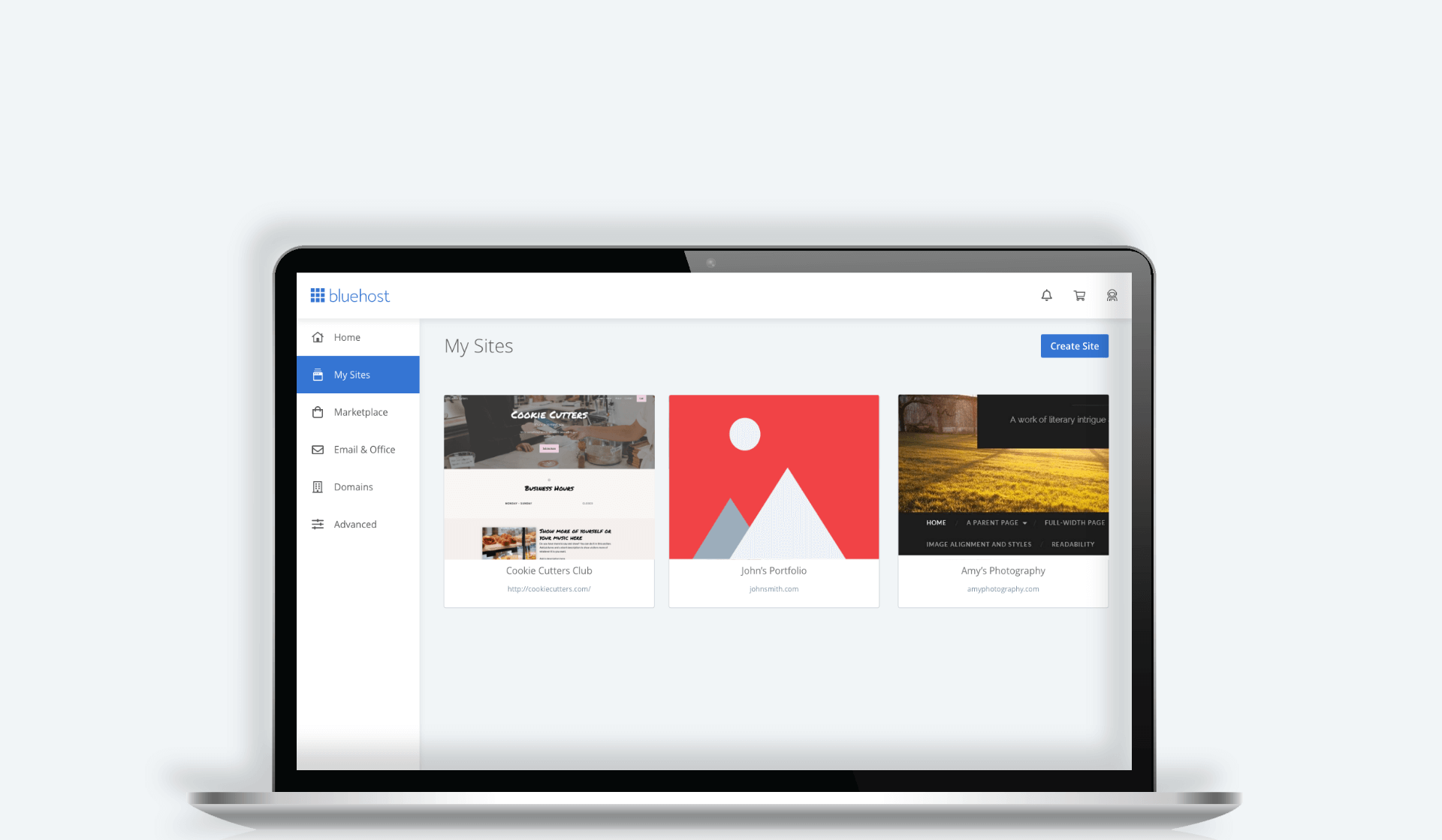
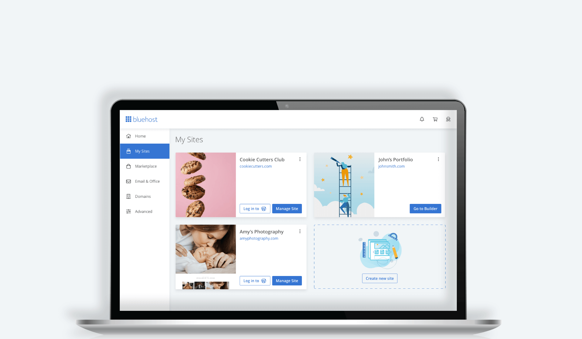
Drag the slider to see before and after
Overview
Users face a lot of challenges when they are building their sites. Bluehost provides solutions to those challenges, but the solutions are located in the Manage Site section of customers’ accounts. Unfortunately, customers don’t look in that section, so they often struggle to build their websites, and sometimes end up leaving Bluehost.
During this project we attempted to solve this issue by identifying usability issues and determining the changes we needed to make to the experience.
Outcomes
– Improved performance of both CTAs
– Increased user engagement with Manage Site CTA (+23%)
– Received positive feedback from users about simplified design
Role
As the lead designer, I was responsible for the initial research, explorations, workshop, mockups, prototypes, technical specs, and design review (QA).
Team
This project was a cross-team effort between Product, Design, Copy, and Engineering.
Duration
This project took around 2 months.
The process.
I like to follow a simple yet powerful process outlined in the Lean UX book. This process helps align the team so we’re all thinking about the problem and equally invested in the process of solving it.

Gathering insights.
We conducted both quantitative and qualitative analyses to learn more about user interactions with the Site card and identify their needs and problems. Here are some key findings we learned through Google Analytics and customer interviews.
Key findings

Information architecture

Understanding the problem.
We got together as a scrum team to better understand the problem, brainstorm and ideate the customer needs, outcomes, assumptions, and hypothesis. We broke down participants’ statements and my observations onto post-its and charted them out using an empathy map.


Identifying top customer needs:
Assumptions
Forming a hypothesis
We believe users don’t know about the services and features Bluehost provides in the Manage Site area because it’s hard to discover. If we unveil those options to the user and point the users in the right direction, they will have a much easier way to find those services and be more successful.
Collaborative design.
We got together as a team and brainstormed some potential solutions to the problem. It always helps to have everyone express their ideas and then vote on those ideas to identify the best one. This exercise really helped us generate as many ideas as possible and helped the team be involved in the design process.


Sketches
Once we identified the winning idea, I sketched out different variations of that idea before I created any wireframes or final designs.


Wireframing the solution
Based on the problems we identified, my solution needed to:
I quickly mocked up some basic wireframes to gather feedback from Product, Engineering and the users on the overall layout and structure of the site selector card. This involved establishing a standardized visual hierarchy and layout for the future site selector card component. I made different variations to review with the design team and decide on the right direction.

Validating the designs.
I conducted usability testing sessions with our primary users to validate whether the new designs would solve their problems. I wrote a script including a scenario asking the users to create new sites, delete and manage site to see what they would do and what they would expect to see.
During the session, I observed how they interacted with the prototype. The usability session revealed that it was easy to see the functionality available and notice the Manage Site button. It was easier for the user to decide where they wanted to click, as both of those buttons were now surfaced and the Manage Site button had a primary color to lead the customers to the features available under that area.

Developing the designs.
I created my high fidelity mockups in Adobe XD and shared a developer’s link to allow the engineers to inspect the file and export the HTML and CSS code and other assets required to build this component.
I worked very closely with the Front End engineers to spec out any missing interactions that were not covered in the high fidelity mockups. I conducted a UX review of each front-end ticket that was implemented to ensure it was aligned with the designs before it went live.

A/B testing
We used Optimizely to help us get data on the new vs old design and see if our solution improved the user experience. We ran a test on 5% of the customer base for 2 weeks.

Results and takeaways.
What would I do differently?

What would I do next?
Soon after this project was over I switched product teams and was no longer the lead designer on it but I was still thinking about it months later. Here’s what I would do next:

More projects

