Visual design meets UX.
Using UX design best practices to rebrand website pages.

Overview
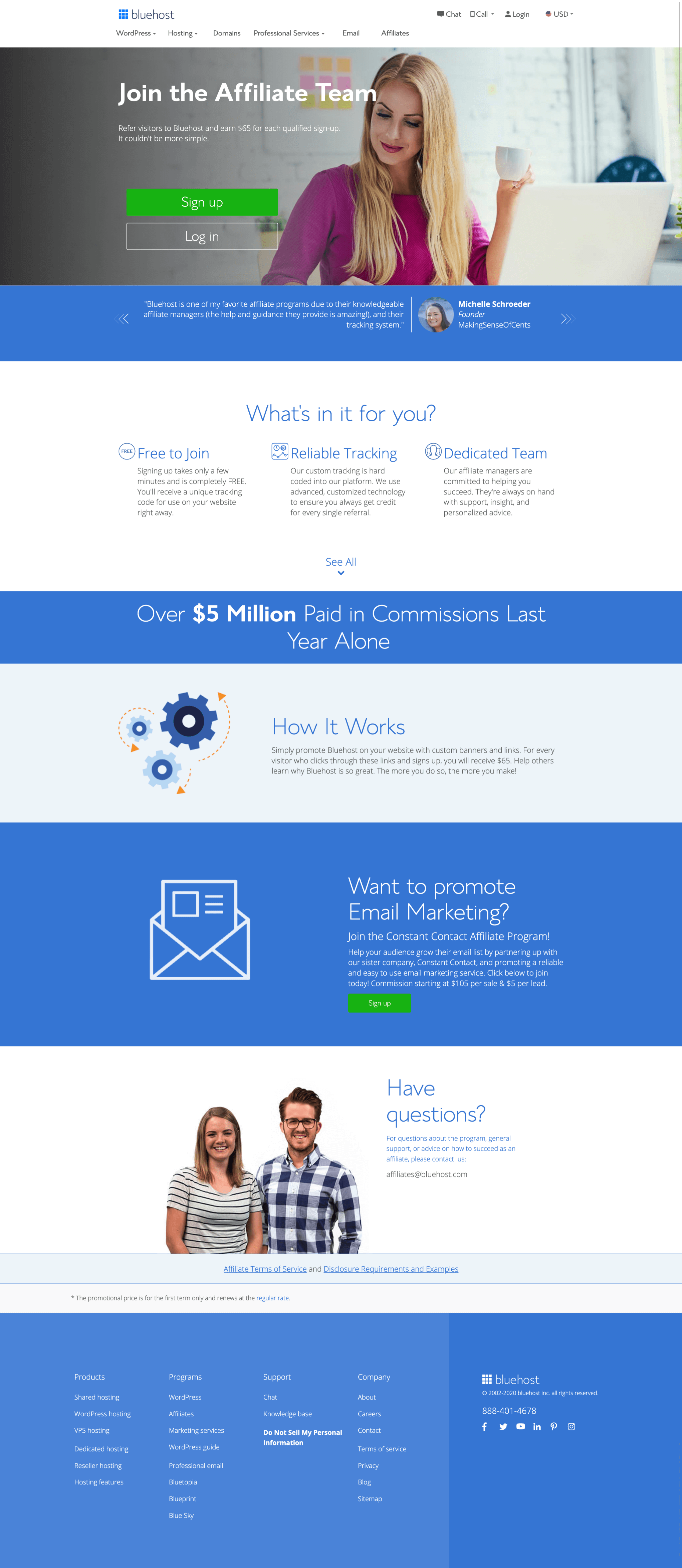
Bluehost is currently under rebranding and changing the styles. Since Bluehost is a pretty old brand, there are over 500 pages that require rebranding and only a hand full of designers on our creative team.
I was part of the group of UX designers who volunteered to help them restyle a few pages and fix usability issues.
Outcome
- 3 redesigned Front-of-Site pages
- The style matches the new brand
- Improved User Experience
Role
As a lead product designer, I was responsible for UX research, mockups, prototyping, technical specs, and design review with engineers (QA).
Team
This project was a cross-team effort between Product, Design, Copy, Creative, Branding, Marketing, Legal and Engineering.
Below is the detailed redesign process of one of the pages
The process.
My process consisted of learning each page’s content, getting rid of things that didn’t need to be there, conducting a comparative analysis to learn what other companies do with similar pages, then getting together with a UX writer to remaster the copy, and then redesigning the pages. After I redesigned the page, I needed to review it with our design team and then with the creative team.
Key questions I asked:
- How does someone get to this page?
- What information are they looking for?
- What are they trying to do?
Terms page.
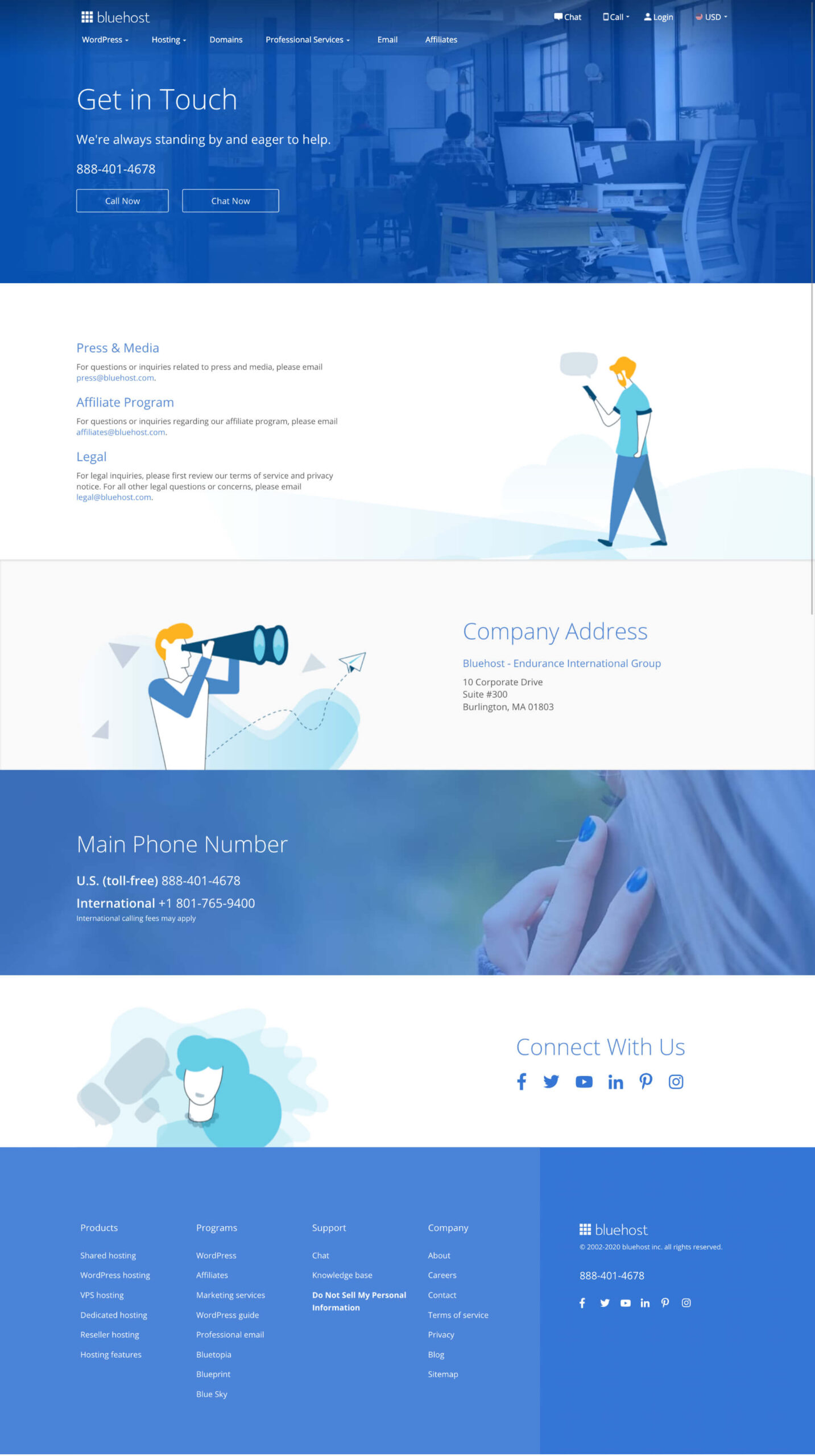
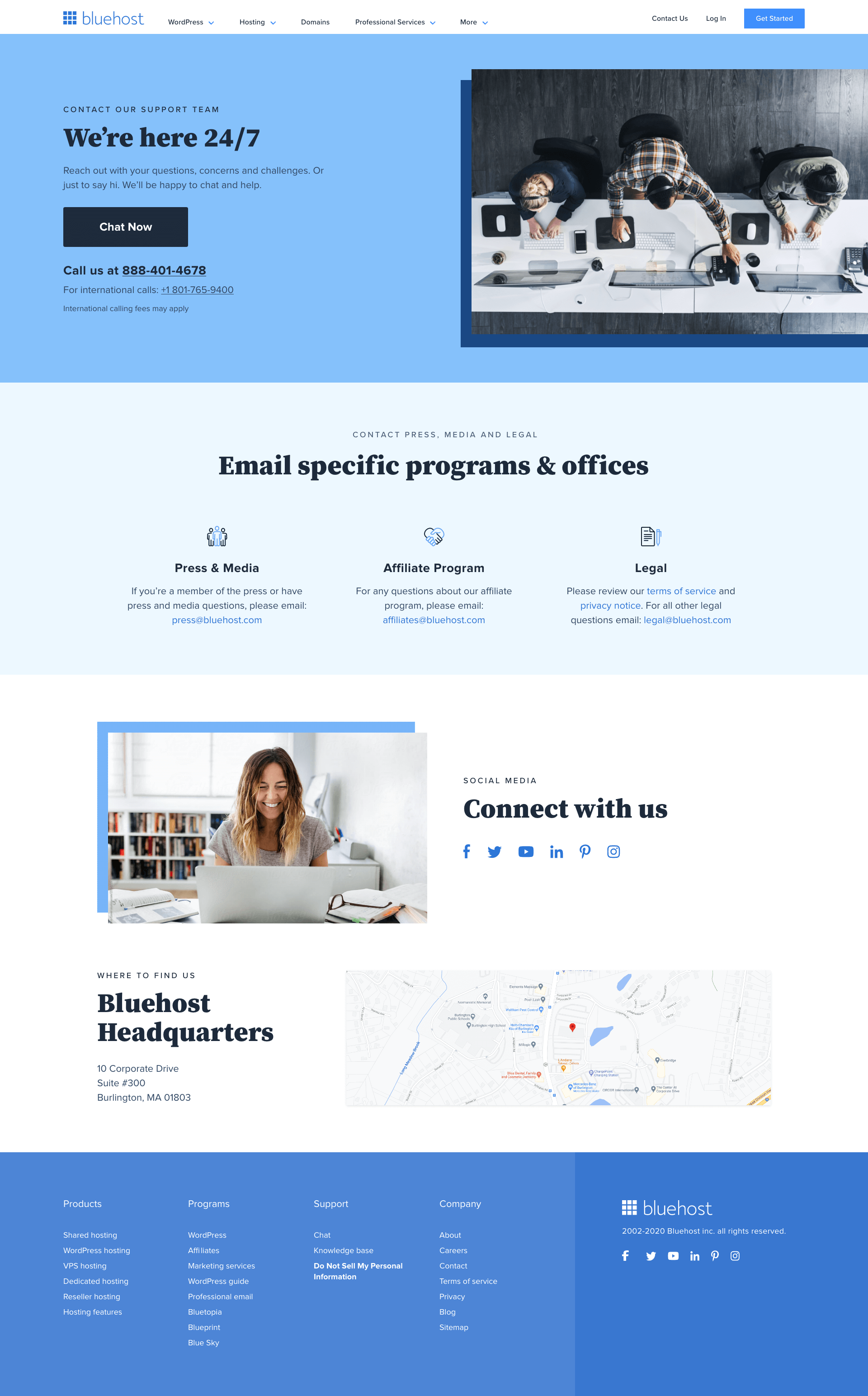
This was a simple page that customers visit when they need to find our general contact information, our location, social media links and other info for press, media or legal. First thing I did with this project was conduct a comparative analysis.
Comparative analysis
In this analysis I compared companies like: GoDaddy, WPengine, Flywheel, Google, Apple, Spotify, Wix, Squarespace, and Kinsta. This analysis helped me identify common areas in each of those brands.

Structure & copy
Then I worked with a UX writer on the structure and copy of this page where we simplified the language and combined some blocks, so that we don’t sound redundant.
Ideation & design
When we identified the copy and the structure we wanted for the page, it was the time to create, get feedback and finalize the designs.

Prototype & build
Once I’d received some feedback and made a few tweaks I was able to move forward and finalize the designs, build the prototype and share it with the Front of site team. I’ve also been in close contact with the Front end engineer to provide assets and conduct a design review during the process of building the page and after.


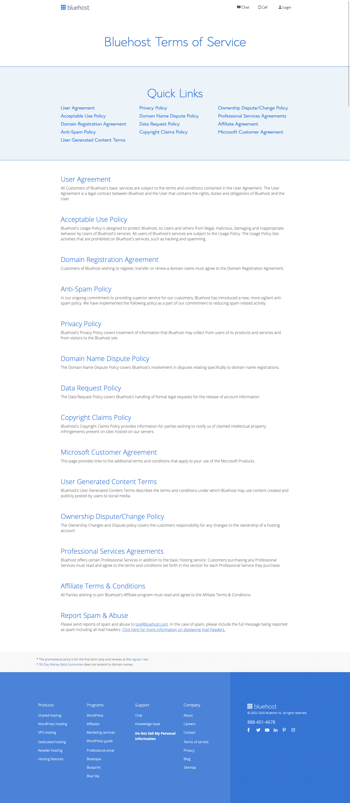
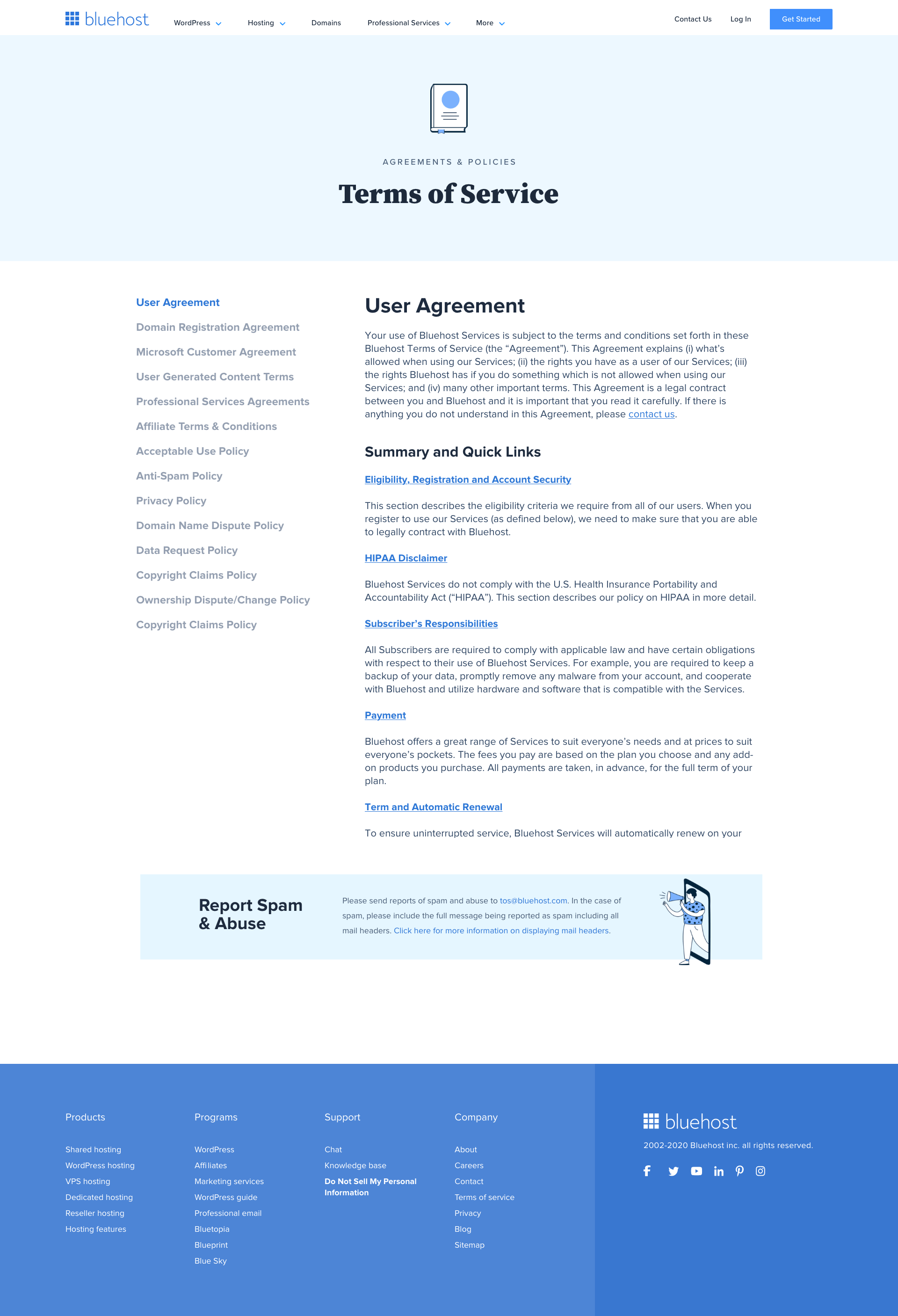
Drag the slider to see before and after
Desktop view (1440px)
After experimenting with different ideas I decided to make sticky left navigation to help switch between the documents, which previously was a problem.
Mobile view (320px)
It’s usually trickier to work with a mobile view when you have a left nav. Since there was a need to switch between the documents, I decided to make it easier on the user by placing the sticky nav at the top as they scroll.
Comments from stakeholders
“Oh, my lord! Never in my life would I think I would like how the terms page could look.”
“Oh man, Vlad. This is so good. I love how you’ve added a left nav. Bravo!”
Key takeaways.
- Working on the Front of Site team can be challenging if they are not using the same design system as the Back of Site team.
- Always sync with the compliance team before and after the project to make sure we are following the legal guidelines.
- Even the most boring page can be made into a fun, user-friendly and functional page when you apply UX principles.

